| Automated charting and reporting |
Chart Samples
Style Examples
SharpLeaf Tutorials
Document Layout Tutorials
Text Flow Tutorials
Table Tutorials
Visual Glossaries
SharpPlot Reference
SharpPlot Class
SharpPlot Properties
SharpPlot Methods
SharpPlot Structures
SharpPlot Enumerations
PageMap Class
SharpLeaf Reference
SharpLeaf Class
SharpLeaf Properties
SharpLeaf Methods
Table Class
Table Properties
Table Methods
SharpLeaf Structures
FontType Structure
ParagraphStyle Structure
BoxStyle Structure
SharpLeaf Enumerations
DocumentLayout Classes
DocumentLayout Class
PageLayout Class
PageElement Abstract Class
Frame : PageElement Class
TextBlock : PageElement Class
ImageBlock : PageElement Class
Box : PageElement Class
Rule : PageElement Class
Common Reference
Document Class
VectorMath Class
DbUtil Class
Download
Release Notes
Licensing
SharpPlot Tutorials > General Tutorials > Working with Multiple series
Working with Multiple series
There are many strategies for showing multiple data series in the same charting space. This tutorial explores the ways SharpPlot allows you to approach the issue of arranging several series on the same page.
Re-using both X and Y axes
Once you have established the axes with your first plot, you can call any of the compatible DrawXx methods to overlay more series on the same scale. Clearly you can only reuse 2D scales with a 2D chart (for example a barchart, then a linegraph) or 3D axes with another 3D chart (for example a cloudchart and a fitted response surface). This example shows how to plot a fitted curve over a simple barchart.
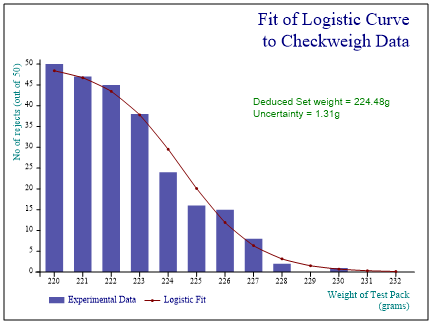
sp.Reset();
sp.FrameStyle = FrameStyles.Boxed;
sp.SetMargins(60,48,36,18);
sp.Heading = "Fit of Logistic Curve\nto Checkweigh Data";
sp.HeadingStyle = HeadingStyles.Right;

sp.SetMarkers(Marker.Bullet);
sp.SetFillStyles(FillStyle.Saturate80);
sp.BarEdgeNib = 0;

sp.SetXLabels(new int[] {220,221,222,223,224,225,226,227,228,229,230,231,232});
sp.SetKeyText(new string[]{"Experimental Data","Logistic Fit"});
sp.XCaption = "Weight of Test Pack\n(grams)";
sp.YCaption = "No of rejects (out of 50)";

sp.DrawBarChart(rejects);

sp.SetPenWidths(1);
sp.LineGraphStyle = (LineGraphStyles.Curves|LineGraphStyles.Markers);

sp.DrawLineGraph(logfit);

sp.NoteStyle = 0;
sp.SetNoteFont("Arial",10,Color.Green);
sp.DrawNote("Deduced Set weight = 224.48g\nUncertainty = 1.31g",8,40);
The one thing to note here is that the BarChart must go first. It always creates an X-axis running upwards from 0.5 with bars positioned at 1,2, ... n and cannot reuse an existing X-scale. If you really need to add bars to an existing chart, you must use the XBar plot which has a ‘real’ X-Axis.
Using more than one (rescaled) YAxis
It is a very common requirement to show two related timeseries against different Y-scales, and SharpPlot gives you a very simple way to do this. The first series you plot will create the left-hand Y-axis in the usual way, then you call NewYAxis() to perform a partial reset – it leaves the XAxis in place and re-ranges the Y-axis to fit the second series.
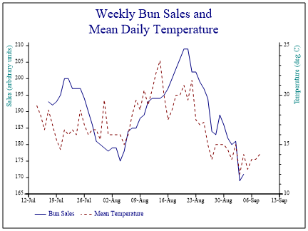
sp.Reset();
sp.FrameStyle = FrameStyles.Boxed;
sp.SetMargins(60,48,36,36);
sp.Heading = "Weekly Bun Sales and\nMean Daily Temperature";

sp.SetPenWidths(0.6);
sp.SetLineStyles(new LineStyle[]{LineStyle.Solid,LineStyle.Dash});
sp.MissingValue = 0;

sp.SetKeyText(new string[]{"Bun Sales","Mean Temperature"});
sp.XAxisStyle = XAxisStyles.Date;
sp.XDateFormat = "dd-MMM";
sp.SetXTickMarks(7);
sp.YCaption = "Sales (arbitrary units)";

sp.DrawLineGraph(buns,date);

sp.NewYAxis();

sp.YCaption = "Temperature (deg C)";
sp.SetYTickMarks(5,4);

sp.DrawLineGraph(temp,date);
The data shows sales of hamburger buns on the left scale and the daily mean temperature on the right. If you want the tick-mark positions to line up (so you can have one set of horizontal gridlines) you will have to work out a good pair of ranges for yourself and set the ranges on both Y-axes explicitly.
Drawing several charts on the same page
SharpPlot defaults to using the entire available paper-size (less a 4-point gutter) for each chart that you draw. You can over-ride this by asking for a new Frame which restricts the plot to a rectangular space within the paper and triggers a complete reset of all properties. It is likely that the charts will share a common heading, and a common key, as shown in this example.
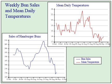
sp.Reset();
sp.FrameStyle = (FrameStyles.Boxed|FrameStyles.Filled);
sp.SetFrameBackground(Color.Green,FillStyle.Saturate20,1.2);
sp.SetMargins(42,48,16,18);
sp.Heading = "Weekly Bun Sales\nand Mean Daily\nTemperatures";
sp.HeadingStyle = HeadingStyles.Left;
sp.DrawFrame();

sp.NewFrame(4,200,256,196);  // Bounds of first chart

sp.FrameStyle = (FrameStyles.Boxed|FrameStyles.Filled);
sp.SetMargins(28,18,26,8);
sp.Heading = "Sales of Hamburger Buns";
sp.HeadingStyle = HeadingStyles.Left;
sp.SetPenWidths(1);
sp.SetColors(ColorTranslator.FromHtml("#2E319E"));
sp.MissingValue = 0;
sp.XAxisStyle = XAxisStyles.Date;
sp.YAxisStyle = YAxisStyles.GridLines;
sp.XDateFormat = "dd-MMM";
sp.SetXTickMarks(7);

sp.DrawLineGraph(buns,date);

sp.NewFrame(180,320,248,180);  // Bounds of second chart

sp.FrameStyle = (FrameStyles.Boxed|FrameStyles.Filled);
sp.SetMargins(28,18,26,8);
sp.Heading = "Mean Daily Temperatures";
sp.HeadingStyle = HeadingStyles.Left;
sp.SetHeadingNudge(8,0);
sp.SetColors(ColorTranslator.FromHtml("#CB2C27"));
sp.SetPenWidths(1);
sp.XAxisStyle = XAxisStyles.Date;
sp.YAxisStyle = YAxisStyles.GridLines;
sp.XDateFormat = "dd-MMM";
sp.SetXTickMarks(7);
sp.DrawLineGraph(temp,date);

// Share common key so reset to entire paper size
sp.NewFrame(432,324);
sp.SetKeyText(new string[]{"Bun Sales","Mean Temperature"});
sp.KeyStyle = (KeyStyles.Vertical|KeyStyles.Boxed);

sp.DrawKey(66,32);  // Notional co-ordinates (100,100) within margins
This can get quite tedious if there are several charts on the paper, but it does give you total control over the positioning. Obviously you need to be careful if you allow parts of one plot to obscure another, as here.
Making life easier with a trellis
The process of segmenting the paper can be automated, if what you want is a collection of charts arranged in a regular pattern. You can choose whether you want a full reset each time you move to a new cell, as often is is more convenient if most of the settings persist across all the charts. Here is an example which might be appropriate in a report on a portfolio of share prices.
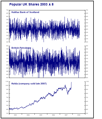
sp.Reset(432,500);  // Paper size
sp.NewFrame(400,500);  // Chart area
sp.FrameStyle = FrameStyles.Boxed;

sp.Heading = "Popular UK Shares 2003 – 8";
sp.HeadingStyle = HeadingStyles.Left;
sp.SetHeadingFont("Arial",14,FontStyle.Bold,Color.Navy);
sp.DrawFrame();

sp.NewFrame(0,470,400,450);  // For all 3 charts

sp.SetTrellis(3,1);  // Three down, one across

sp.NewCell();        // Move to first cell and set all properties
sp.Heading = "Halifax Bank of Scotland";
sp.SetHeadingFont("Arial",10,FontStyle.Bold,Color.Navy);
sp.HeadingStyle = HeadingStyles.Left;
sp.SetHeadingNudge(10,-8);
sp.SetMargins(10,0,36,36);
sp.MissingValue = 0;
sp.XAxisStyle = (XAxisStyles.Clipped|XAxisStyles.AnnualTicks|XAxisStyles.PlainAxis);
sp.SetLabelFont("Times New Roman",6,Color.Black);
sp.YIntercept = 700;
sp.YAxisStyle = (YAxisStyles.Clipped|YAxisStyles.DuplicateAxes);
sp.YTickStyle = YTickStyles.InsideTicks;
sp.DrawLineGraph(HBOS,ShareDates);

sp.NewCell();       // Second cell reuses most properties
sp.Heading = "British Petroleum";
sp.YIntercept = 400;
sp.DrawLineGraph(BP,ShareDates);

sp.NewCell();      // Third cell similarly
sp.Heading = "Kelda (company sold late 2007)";
sp.XAxisStyle = (XAxisStyles.Clipped|XAxisStyles.MiddleLabels|XAxisStyles.AnnualTicks);
sp.YIntercept = 300;
sp.DrawLineGraph(Kelda,ShareDates);
Note how you only need to change the properties which are specific to each chart. If all the charts are identical (just iterating around a dimension in the data) you may be able to automate the process completely by using sp.DrawMultiple to iterate around the cells for you.
Driving the trellis with a scatterplot
For geographical data, you often need to place the individual plots at the correct location on a map. A nice example occured in the Proceedings of the Yorkshire Geological Society a few years ago showing the orientation of corals at various quarries in northern England.
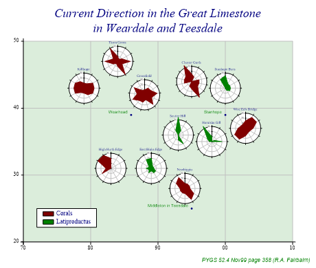
sp.Reset(460,390);  // Paper size
sp.SetMargins(56,34,30,30);
sp.Heading = "Current Direction in the Great Limestone\nin Weardale and Teesdale";
sp.SetHeadingFont("Times New Roman",18,FontStyle.Italic,Color.Navy);
sp.Footnote = "PYGS 52.4 Nov99 page 358 (R.A. Fairbairn)";
sp.SetFootnoteFont("Arial",8,FontStyle.Italic,Color.Green);
sp.FootnoteStyle = FootnoteStyles.Right;

sp.SetMarkers(Marker.Bullet);
sp.ScatterPlotStyle = (ScatterPlotStyles.ValueTags|ScatterPlotStyles.GridLines);
sp.SetChartBackground(Color.Green,FillStyle.Saturate20,0);
sp.SetGridLineStyle(Color.Silver,LineStyle.Solid,0.7);
sp.SetValueTags(new string[]{"Wearhead","Stanhope","Middleton in Teesdale"});
sp.ValueTagStyle = ValueTagStyles.Left;
sp.SetAxisStyle(Color.Black,LineStyle.Solid,1);
sp.SetXRange(70,110);
sp.SetXTickMarks(10);
sp.SetXLabels(new string[]{"70","80","90","00","10"});
sp.SetYRange(20,50);
sp.SetYTickMarks(10);
sp.SetYLabels(new string[]{"20","30","40","50"});

sp.DrawScatterPlot(new int[]{39,39,25},new int[]{86,100,95});  // Towns

sp.ScatterPlotStyle = (ScatterPlotStyles.CellsCreated|ScatterPlotStyles.NoMarkers);
sp.SetCellSize(64);
sp.DrawScatterPlot(new int[]{43,47,42,44,43,37,35,36,28,31,31},     // Quarry Eastings
                   new int[]{79,84,88,95,100,103,98,93,94,89,83});  // Northings

// Create the legend by hand!
sp.SetKeyText(new string[]{"Corals","Latiproductus"});
sp.KeyStyle = (KeyStyles.Vertical|KeyStyles.Boxed);
sp.SetKeyBackground(Color.White,FillStyle.Solid,1.1);
kd1 = new KeyDefinition(2,Color.Maroon);
kd2 = new KeyDefinition(2,Color.Green);
sp.DrawKey(72,25,new KeyDefinition[]{kd1,kd2});

// First quarry sets all the properties
sp.ResetProperties();

sp.NewCell();
sp.SetColors(Color.Maroon);
sp.Gutter = 0;
sp.SetMargins(10);
sp.SetChartBackground(Color.White,FillStyle.Solid,0);
sp.Heading = "Killhope";
sp.PolarChartStyle = (PolarChartStyles.SurfaceShading|PolarChartStyles.GridLines);
sp.SetYRange(0,30);
sp.LabelStyle = LabelStyles.Opaque;
sp.DrawPolarChart(new int[] {10,10,20,20,20,15,10,10,20,20,20,15});

sp.NewCell();
sp.Heading = "Thorn Green";
sp.DrawPolarChart(new int[] {10,5,10,25,10,30,10,5,10,25,10,30});

sp.NewCell();
sp.Heading = "Greenfield";
sp.DrawPolarChart(new int[] {10,15,15,25,15,25,10,15,15,25,15,25,10});

sp.NewCell();
sp.Heading = "Chester Garth";
sp.DrawPolarChart(new int[] {15,10,0,15,15,15,35,15,10,0,15,15,15,35});

sp.NewCell();
sp.SetColors(Color.Green);
sp.Heading = "Stanhope Burn";
sp.DrawPolarChart(new int[] {25,10,10,10,10,5,0,0,0,0,0,20});

sp.NewCell();
sp.SetColors(Color.Maroon);
sp.Heading = "Wise Eels Bridge";
sp.DrawPolarChart(new int[] {15,25,25,15,10,10,15,25,25,15,10,10});

sp.NewCell();
sp.SetColors(Color.Green);
sp.Heading = "Harnisha Gill";
sp.DrawPolarChart(new int[] {10,0,5,20,0,0,0,0,0,5,10,35});

sp.NewCell();
sp.Heading = "Scutter Hill";
sp.DrawPolarChart(new int[] {35,10,0,0,0,20,10,0,0,0,0,10});

sp.NewCell();
sp.SetColors(Color.Maroon);
sp.Heading = "Newbiggin";
sp.DrawPolarChart(new int[] {10,10,10,10,20,25,10,10,10,10,20,25});

sp.NewCell();
sp.SetColors(Color.Green);
sp.Heading = "East Binks Edge";
sp.DrawPolarChart(new int[] {20,5,5,5,10,10,5,10,5,10,5,20});

sp.NewCell();
sp.SetColors(Color.Maroon);
sp.Heading = "High Hurth Edge";
sp.DrawPolarChart(new int[] {20,0,0,0,0,0,0,0,20,10,30,30});
The initial scatterplot of the quarries is drawn with no lines or markers, and simply leaves behind it a collection of frames which can be used by each polar plot in turn. Note that the paper is carefully sized to make the (x,y) squares exactly square here.
See also ...
SharpPlot.NewYAxis Method | SharpPlot.SetTrellis Method