| Automated charting and reporting |
General Tutorials
Style Examples
SharpLeaf Tutorials
Document Layout Tutorials
Text Flow Tutorials
Table Tutorials
Visual Glossaries
SharpPlot Reference
SharpPlot Class
SharpPlot Properties
SharpPlot Methods
SharpPlot Structures
SharpPlot Enumerations
PageMap Class
SharpLeaf Reference
SharpLeaf Class
SharpLeaf Properties
SharpLeaf Methods
Table Class
Table Properties
Table Methods
SharpLeaf Structures
FontType Structure
ParagraphStyle Structure
BoxStyle Structure
SharpLeaf Enumerations
DocumentLayout Classes
DocumentLayout Class
PageLayout Class
PageElement Abstract Class
Frame : PageElement Class
TextBlock : PageElement Class
ImageBlock : PageElement Class
Box : PageElement Class
Rule : PageElement Class
Common Reference
Document Class
VectorMath Class
DbUtil Class
Download
Release Notes
Licensing
SharpPlot Tutorials > Chart Samples > Polar and Radar charts
Polar and Radar charts
The ‘Radar’ chart is logically similar to a Barchart, in that the given data is arranged at equal intervals. The difference is that the Radar chart arranges the values around a circle at equal angles, which is often a good way of comparing several sets of performance indicators.
The ‘Polar’ chart is simply a variant of the Linegraph where the y-values become radii and the x-values angles around a circle. It is typically used to plot data which has a natural cycle, for example daily temperatures or annual rainfall. It can also be used as a type of scatterplot, where the angles represent compass directions or times of day.
Comparing Features with a Radar Chart
This chart compares two fictional vehicles based on seven criteria which are plotted as radial lines.

sp.Heading = "Two Cars\nCompared";
sp.HeadingStyle = HeadingStyles.Left;

Volvo = new int[] {20,36,29,42,31,36,34};
Saab = new int[] {30,24,28,34,23,34,28};
criteria = new string[]{"Speed and handling","Fuel consumption","Comfort and "+
         "legroom","Reliability record","Safety","Seating and luggage space",
         "Service interval"};

sp.PolarChartStyle = PolarChartStyles.GridLines|PolarChartStyles.SurfaceShading;
sp.YAxisStyle = YAxisStyles.ForceZero;
sp.MarginLeft = 12;
sp.MarginRight = 0;
sp.SetXLabels(criteria);
sp.XLabelFormat = "XXXXXXXXX;";
sp.LabelLineSpacing = 120;

sp.SetFillStyles(FillStyle.Opacity30);

polardata = new int[][]{Volvo,Saab};
sp.DrawPolarChart(polardata,new int[0]);
The semi-transparent overlay makes it very easy to compare the ‘shapes’ which characterise the two sets of data.
Summarizing Directional Data
This is also a Radar chart, although it could have been plotted with additional angular values, if the directions were not equally spaced around the circle. It shows an alternative presentation to the Rose diagram of the corrie data from the Scottish highlands.
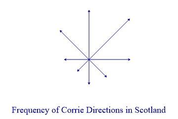
sp.Heading = "Frequency of Corrie Directions in Scotland";

corries = new int[] {6,7,5,3,3,2,3,5};

sp.PolarChartStyle = PolarChartStyles.Risers|PolarChartStyles.ArrowLines|
         PolarChartStyles.NoLines;
sp.HeadingStyle = HeadingStyles.Bottom;
sp.SetPenWidths(0.8);
sp.SetMargins(0);
sp.YAxisStyle = YAxisStyles.NoAxis|YAxisStyles.ForceZero;
sp.XAxisStyle = XAxisStyles.NoAxis;
sp.SetArrowStyle(6,30);  // Size,angle

sp.DrawPolarChart(corries);
Scaled markers could be used instead of arrows with this chart style to give an indication of average size as well as frequency of occurence. This is probably a more ‘honest’ chart than the equivalent Rose diagram, as it does not exaggerate the larger numbers in the same way.
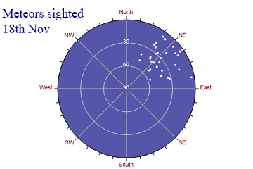
ScatterPlot of the Night Sky
This is genuinely Polar data, so it is best plotted around a circle. The y-values are altitude (but of course 90 is at the Zenith) and the x-values give the direction of the observation.
altitude = new int[] {8,42,1,38,20,35,34,28,22,50,52,40,30,10,7,41,41,17,11,30,5,8,
         42,42,19,24,57,38,32,4,19,40,41,49};
azimuth = new int[] {48,42,55,63,48,51,75,41,32,51,51,38,48,57,35,54,23,70,54,40,55,
         38,69,70,64,35,69,37,77,80,33,47,45,25};

sp.Heading = "Meteors sighted\n18th Nov";
sp.HeadingStyle = HeadingStyles.Left;

sp.SetMargins(24,12,0,0);

sp.SetXLabels(new string[]{"North","NE","East","SE","South","SW","West","NW"});
sp.SetXTickMarks(45,3);
sp.SetYTickMarks(new int[] {0,30,60,90});
sp.SetXLabelFont("arial",8,FontStyle.Regular,Color.Maroon);
sp.SetYLabelFont("arial",8,FontStyle.Regular,Color.White);
sp.YAxisStyle = YAxisStyles.InvertAxis|YAxisStyles.InvisibleAxis;
sp.YTickStyle = YTickStyles.NoTicks;
sp.PolarChartStyle = PolarChartStyles.Markers|PolarChartStyles.GridLines|
         PolarChartStyles.CompassPlot|PolarChartStyles.NoLines;
sp.SetChartBackground(Color.Navy,FillStyle.Saturate80);
sp.LabelStyle = LabelStyles.Opaque;  // Background for circle - also May 03
sp.SetMarkers(Marker.Bullet);
sp.SetColors(Color.White);

sp.DrawPolarChart(altitude,azimuth);
This chart could also be used with daily data, for example a count web-site hits over 24 hours.
Circular Linegraph of Daily Temperatures
This chart copies the typical pen-recorder often seen in computer rooms to track tempterature and humidity.
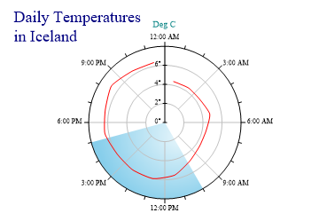
sp.Heading = "Daily Temperatures\nin Iceland";
sp.HeadingStyle = HeadingStyles.Left;
sp.SetMargins(48,12,12,0);

times = new double[] {0.8,2.3,3.8,5.3,6.8,8.3,9.8,11.3,12.8,14.3,15.8,17.3,18.8,
         20.3,21.8,23.3};
temps = new double[] {4.4,4.4,4.4,4.8,4.4,4.4,4.8,5.6,6,6,6,6.4,6.4,6.8,6.4,6.4};

sp.SetYRange(0,8);
sp.SetYTickMarks(2);
sp.SetXTickMarks(3,2);

sp.YLabelFormat = "#0°";

sp.YCaption = "Deg C";
sp.SetColors(Color.Red);
sp.SetPenWidths(1.5);

sp.SetXZones(new Zone(10,17,Color.SkyBlue,FillStyle.Dome));

sp.PolarChartStyle = PolarChartStyles.ClockFace|PolarChartStyles.GridLines|
         PolarChartStyles.Curves|PolarChartStyles.HollowCenter;
sp.DrawPolarChart(temps,times);
The data values become radii, and time is plotted around the circle as a 24-hour clock – the x-tickmarks are given in hours here. X-zones may be used to indicate times of day.
Summary
The polar plot is a fairly special-purpose chart, but for some types of data it is the only good way to make a readable layout.