| Automated charting and reporting |
General Tutorials
Style Examples
SharpLeaf Tutorials
Document Layout Tutorials
Text Flow Tutorials
Table Tutorials
Visual Glossaries
SharpPlot Reference
SharpPlot Class
SharpPlot Properties
SharpPlot Methods
SharpPlot Structures
SharpPlot Enumerations
PageMap Class
SharpLeaf Reference
SharpLeaf Class
SharpLeaf Properties
SharpLeaf Methods
Table Class
Table Properties
Table Methods
SharpLeaf Structures
FontType Structure
ParagraphStyle Structure
BoxStyle Structure
SharpLeaf Enumerations
DocumentLayout Classes
DocumentLayout Class
PageLayout Class
PageElement Abstract Class
Frame : PageElement Class
TextBlock : PageElement Class
ImageBlock : PageElement Class
Box : PageElement Class
Rule : PageElement Class
Common Reference
Document Class
VectorMath Class
DbUtil Class
Download
Release Notes
Licensing
SharpPlot Tutorials > Chart Samples > Pie charts and Rose diagrams
Pie charts and Rose diagrams
Piecharts are best used with a small number of data items where the values represent some part of a total. Typically the numbers will be percentages, and the sector values will differ significantly. If it is important for the user to be able to compare values accurately, a simple Barchart is almost always a better choice.
A Basic Pie with Spider Tags
This example shows a piechart with most of the options left to default.

sp.SetMargins(16,0,6,6);
sp.Heading = "A Basic\nPiechart";
sp.HeadingStyle = HeadingStyles.Right;

sp.SetXLabels(new string[]{"Hello","World","This label will be wrapped"});
sp.SetLabelFont("Arial",10,FontStyle.Bold,Color.Navy);
sp.XLabelFormat = "XXXXXXXXXXXXXX;";
sp.DrawPieChart(new int[]{13,3,2},new int[]{0,20,0});
Note that SharpPlot treats piecharts as if they have an ‘x-axis’ so this example uses X-labels and wraps them with an X-axis formatter. The chart allows ‘reasonable’ headspace for the labels (within the chart margins) but it may be necessary to adjust either the positioning or radius of the pie if there is a lot of long label text.
Labelling inside the sectors
This chart complements the political graphic in the Barchart tutorial by showing the percentage of votes cast for each party.
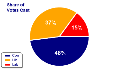
sp.SetMargins(18,24,18,0);

Party = new string[]{"Con","Lib","Lab"};
Votepc = new int[] {48,37,15};

sp.Heading = "Share of\nVotes Cast";
sp.HeadingStyle = HeadingStyles.Left;
sp.SetHeadingFont("ARB",14);

sp.PieChartStyle = PieChartStyles.ValueTags;
sp.PieStartAngle = 90;
sp.SetEdgeStyle(Color.White,LineStyle.Solid,3);  // SharpPlot.SetEdgeStyle
sp.ValueTagStyle = ValueTagStyles.Inside;
sp.SetValueFont("ARB",18,Color.White);
sp.ValueTagFormat = "#0%";

sp.SetColors(new Color[]{Color.Navy,Color.Orange,Color.Red});  // Party colors
sp.DrawPieChart(Votepc);

sp.SetKeyText(Party);
sp.KeyStyle = KeyStyles.Vertical|KeyStyles.Boxed|KeyStyles.Rounded|
         KeyStyles.Shadowed|KeyStyles.LeftAlign|KeyStyles.BottomAlign;
sp.SetKeyFont("ARB",11,Color.Navy);
The numbers are written inside each sector here. Obviously, this approach only works if most of the sectors are reasonably large as SharpPlot will simply omit any labels which don’t fit. This pie starts drawing from the 3:00 line (rather than midnight) and uses a thick white edge to give a ‘dissected’ appearance.
Note that SharpPlot does not multiply the values by 100 here – the ‘%’ symbol is treated like any other insertion character and has no special meaning.
Merging values and labels
This is a very similar example, but instead of drawing a separate legend, it uses a special format string to merge the X-label text into the spider tags. The string ‘XL’ is treated as an insertion point for the corresponding value from the array of labels.
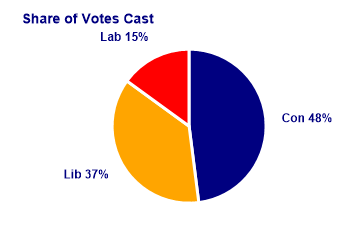
sp.SetMargins(12,0,18,0);

Party = new string[]{"Con","Lib","Lab"};
Votepc = new int[] {48,37,15};

sp.Heading = "Share of Votes Cast";
sp.HeadingStyle = HeadingStyles.Left;
sp.SetHeadingFont("ARB",14);

sp.PieChartStyle = PieChartStyles.ValueTags|PieChartStyles.Plain;
sp.SetEdgeStyle(Color.White,LineStyle.Solid,3);
sp.SetXLabels(Party);
sp.SetXLabelFont("ARB",12,Color.Navy);
sp.ValueTagFormat = "XL #0%";

sp.SetColors(new Color[]{Color.Navy,Color.Orange,Color.Red});

sp.DrawPieChart(Votepc);
The ‘plain’ style simply omits the spider lines.
Drawing a Rose Diagram
This is a fairly uncommon plot, but does illustrate the possibility of varying the sector radii as well as the angular values. The data is genuine, and shows that snowfields tend to stick around more on NE-facing slopes! Note that you must give 8 equal values for the angles, and set the appropriate style here to have the explosions treated as radii.
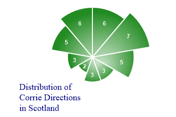
sp.Heading = "Distribution of\nCorrie Directions\nin Scotland";
sp.HeadingStyle = HeadingStyles.Bottom|HeadingStyles.Left;

corries = new int[] {6,7,5,3,3,2,3,5};

sp.PieChartStyle = PieChartStyles.ValueTags|PieChartStyles.RoseDiagram;
sp.SetValueTags(corries);
sp.ValueTagStyle = ValueTagStyles.Inside;
sp.SetValueFont("ARB",12,Color.White);

sp.SetColors(Color.ForestGreen);
sp.SetEdgeStyle(Color.White,LineStyle.Solid,2);

sp.PieRadius = 2400;  // Scale up entire pie

sp.SetFillStyles(FillStyle.Dome);

sp.DrawPieChart(new int[]{1,1,1,1,1,1,1,1,1},corries);
Note that the entire pie is scaled to about 20 times normal size, as the radii are taken as percentages of standard, which would result in very tiny sectors here. The ‘dome’ style of radial gradient works well with Pie and Polar charts as it is always drawn radially from the centre of the entire chart.
Summary
Piecharts are best used as top-level summaries, showing quite small numbers of values. They often make a good starting point for a ‘drilldown’ process, where the user may click on each sector to get a more detailed picture of some aspect of company performance.