| Automated charting and reporting |
General Tutorials
Style Examples
SharpLeaf Tutorials
Document Layout Tutorials
Text Flow Tutorials
Table Tutorials
Visual Glossaries
SharpPlot Reference
SharpPlot Class
SharpPlot Properties
SharpPlot Methods
SharpPlot Structures
SharpPlot Enumerations
PageMap Class
SharpLeaf Reference
SharpLeaf Class
SharpLeaf Properties
SharpLeaf Methods
Table Class
Table Properties
Table Methods
SharpLeaf Structures
FontType Structure
ParagraphStyle Structure
BoxStyle Structure
SharpLeaf Enumerations
DocumentLayout Classes
DocumentLayout Class
PageLayout Class
PageElement Abstract Class
Frame : PageElement Class
TextBlock : PageElement Class
ImageBlock : PageElement Class
Box : PageElement Class
Rule : PageElement Class
Common Reference
Document Class
VectorMath Class
DbUtil Class
Download
Release Notes
Licensing
SharpPlot Tutorials > Chart Samples > Min-Max or Hi-Lo charts
Min-Max or Hi-Lo charts
This chart is often used in combination with a LineGraph or ScatterPlot to show range in addition to daily values. The first example creates a typical ‘High-Low-Close’ chart from daily share price information, and the second shows how errorbars can be added to a scatterplot of experimental data. However, it can be used on its own, for example to show the span of frost-free days across the year as a timeseries.
A Typical Hi-Lo-Close Plot
There are many variations on this chart, but most of them come down to a combination of a MinMax and an overlayed scatterplot.
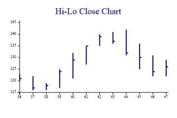
hi = new int[] {123,122,119,125,132,135,140,141,142,136,131,129};
lo = new int[] {120,116,116,117,121,127,135,136,131,125,122,122};
close = new int[] {121,117,118,124,129,135,139,137,132,130,124,126};
wkno = new int[] {36,37,38,39,40,41,42,43,44,45,46,47};

sp.Heading = "Hi-Lo Close Chart";

sp.SetColors(Color.Navy);
sp.SetPenWidths(2);
sp.DrawMinMaxChart(hi,lo,wkno);

sp.SetMarkers(Marker.RightTick);
sp.DrawScatterPlot(close,wkno);
The ‘LeftTick’ and ‘RightTick’ markers are specifically designed for this type of chart – you could additionally use a LeftTick to show the opening level if required.
Adding Errorbars to a ScatterPlot
Experimental data may have errors on the y-dimension, the x-dimension or both. This chart is very similar to the Hi-Lo plot, but uses two MinMax charts to show errors in both X and Y directions.
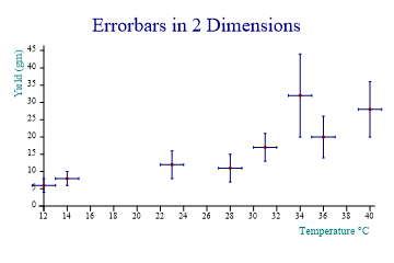
yield = new int[] {6,8,12,11,17,32,20,28};
temp = new int[] {12,14,23,28,31,34,36,40};
error = new int[] {2,2,4,4,4,12,6,8};

sp.Heading = "Errorbars in 2 Dimensions";
sp.XCaption = "Temperature °C";
sp.YCaption = "Yield (gm)";

sp.SetColors(new Color[]{Color.Navy,Color.Navy,Color.Maroon});
sp.MinMaxChartStyle = MinMaxChartStyles.ErrorBars;
sp.DrawMinMaxChart(VectorMath.Sum(yield,error),VectorMath.Subtract(yield,error),temp);

sp.MinMaxChartStyle = MinMaxChartStyles.ErrorBars|MinMaxChartStyles.Horizontal;
sp.DrawMinMaxChart(VectorMath.Sum(temp,1),VectorMath.Subtract(temp,1),yield);

sp.SetMarkers(Marker.Bullet);

sp.DrawScatterPlot(yield,temp);
Note that the scatter is typically the last chart to be drawn, so that the errorbars set the Y-axis range. If the X-errors are very large it may be necessary to set the X-axis range explicitly here. This also has the effect of placing the markers on top of the errorbars, which looks much cleaner.
Frost-free days as a TimeSpan
This time, a horizontal chart style is used so that the years are stacked vertically up the page.
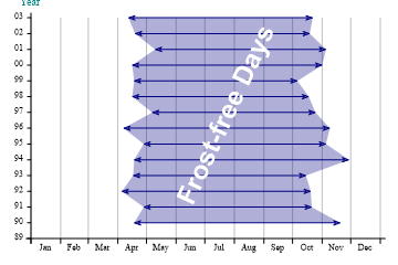
sp.SetMargins(12,20,24,12);

years = new int[] {89,90,91,92,93,94,95,96,97,98,99,0,1,2,3};
days = new int[] {31,29,31,30,31,30,31,31,30,31,30,31};
dmax = new int[] {324,294,293,288,333,309,313,298,291,279,305,309,292,295};
dmin = new int[] {108,118,95,107,108,118,97,127,106,108,106,130,109,102};

sp.SetXTickMarks(VectorMath.Catenate(0,VectorMath.RunningTotal(days)));
sp.XAxisStyle = XAxisStyles.GridLines|XAxisStyles.MiddleLabels|XAxisStyles.ForceZero;
sp.SetXLabels(new string[]{"Jan","Feb","Mar","Apr","May","Jun","Jul","Aug","Sep",
         "Oct","Nov","Dec"});
sp.YAxisStyle = YAxisStyles.ForceZero|YAxisStyles.AtEndCaption;
sp.YCaption = "Year";
sp.YLabelFormat = "00";
sp.SetYLabels(years);
sp.SetYTickMarks(1);

sp.MinMaxChartStyle = MinMaxChartStyles.Horizontal|MinMaxChartStyles.ArrowLines|
         MinMaxChartStyles.Envelope;
sp.SetFillStyles(FillStyle.Opacity30);

sp.SetArrowStyle(7,20,FillStyle.Saturate80);

sp.DrawMinMaxChart(dmax,dmin);

sp.SetNoteFont("Arial",24,FontStyle.Bold,Color.White);
sp.DrawNote("Frost-free Days",170,2,65);
This gives a clear picture of the ‘growing season’ from year to year. The arrowheads have been ‘customised’ a little here (the default shape is a little too fat) and an angled note is used to label the central region.
Using Envelope Fill as a Backcloth
Another good use of this chart is to show increasing uncertainty into the future. This example shows a projected cumulative spending pattern, with an overrun zone to allow for ‘contingencies’ which cannot be planned for.
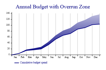
sp.Heading = "Annual Budget with Overrun Zone";

budget = new int[] {0,5,15,17,20,34,53,66,72,87,92,102,104};
bmax = new int[] {0,6,18,22,27,44,66,82,91,109,118,131,137};
xdata = new int[] {0,1,2,3,4,5,6,7,8,9,10,11,12};

sp.XAxisStyle = XAxisStyles.GridLines|XAxisStyles.MiddleLabels|XAxisStyles.ForceZero;
sp.SetXLabels(new string[]{"Jan","Feb","Mar","Apr","May","Jun","Jul","Aug","Sep",
         "Oct","Nov","Dec"});

sp.SetColors(Color.Navy);
sp.MinMaxChartStyle = MinMaxChartStyles.Envelope|MinMaxChartStyles.NoLines;
sp.SetFillStyles(FillStyle.GradientBottom);

sp.DrawMinMaxChart(budget,bmax,xdata);

sp.SetPenWidths(2);
sp.DrawLineGraph(budget,xdata);
sp.SetKeyText(new string[]{"","Cumulative budget spend"});
This could be used with financial data to show deviation from budget, or the movement of some key variable within its ‘allowed’ band. It could also show the confidence limits around a modelfit or economic forecast.
Summary
The MinMax chart is ideal wherever data has a natural range. It can also be used as a backcloth to many other charts to show an allowed or predicted range for a data series.