| Automated charting and reporting |
General Tutorials
Style Examples
SharpLeaf Tutorials
Document Layout Tutorials
Text Flow Tutorials
Table Tutorials
Visual Glossaries
SharpPlot Reference
SharpPlot Class
SharpPlot Properties
SharpPlot Methods
SharpPlot Structures
SharpPlot Enumerations
PageMap Class
SharpLeaf Reference
SharpLeaf Class
SharpLeaf Properties
SharpLeaf Methods
Table Class
Table Properties
Table Methods
SharpLeaf Structures
FontType Structure
ParagraphStyle Structure
BoxStyle Structure
SharpLeaf Enumerations
DocumentLayout Classes
DocumentLayout Class
PageLayout Class
PageElement Abstract Class
Frame : PageElement Class
TextBlock : PageElement Class
ImageBlock : PageElement Class
Box : PageElement Class
Rule : PageElement Class
Common Reference
Document Class
VectorMath Class
DbUtil Class
Download
Release Notes
Licensing
SharpPlot Tutorials > Chart Samples > Step charts for discontinuous data
Step charts for discontinuous data
Step charts are used for two main chart-types. They are a very convenient way of plotting a timeseries where there may be an instantaneous change between values, which then stay fixed for some time – government interest-rates are typical. Filled stepcharts work well in combination with Barcharts, and they can also be used instead of the Histogram where data has been aggregated into categories of varying widths.
A Simple Stepchart
This chart-type is unusual in that the x-data typically has one more value than the y-data, giving the endpoint of the final plateau in the data.
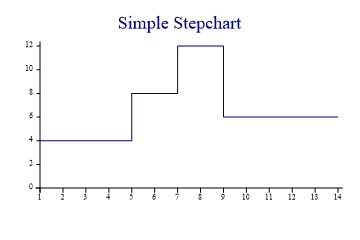
ydata = new int[] {4,8,12,6};
steps = new int[] {1,5,7,9,14};

sp.YAxisStyle = YAxisStyles.ForceZero;
sp.Heading = "Simple Stepchart";

sp.DrawStepChart(ydata,steps);
Rainfall Totals by Month
The Stepchart is ideal for showing aggregated data where the groups have varying widths (in this case the months are quite similar, but we should still be honest about February). Monthly totals are written using value-tags on the top of each block.
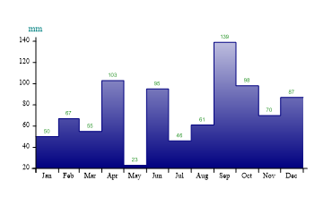
months = new int[] {0,31,59,90,120,151,181,212,243,273,304,334,365};
monthnames = new string[]{"Jan","Feb","Mar","Apr","May","Jun","Jul","Aug","Sep",
         "Oct","Nov","Dec"};
rudland = new int[] {50,67,55,103,23,95,46,61,139,98,70,87};

sp.StepChartStyle = StepChartStyles.SurfaceShading|StepChartStyles.ValueTags;
sp.SetXTickMarks(months);
sp.XAxisStyle = XAxisStyles.MiddleLabels;
sp.SetXLabels(monthnames);
sp.YAxisStyle = YAxisStyles.AtEndCaption;
sp.YCaption = "mm";

sp.SetFillStyles(FillStyle.GradientBottom);

sp.DrawStepChart(rudland,months);
Note that the month boundaries have been used for the step-points and also to set the tick-marks for the X-axis.
A Discontinuous Timeseries
This chart shows the values of the UK bank-rate over the last eight years.
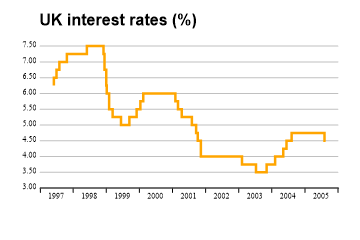
sp.SetPenWidths(2.5);
sp.SetColors(Color.Orange);

sp.Heading = "UK interest rates (%)";
sp.HeadingStyle = HeadingStyles.Left;
sp.SetHeadingFont("arial",16,FontStyle.Bold,Color.Black);
sp.XAxisStyle = XAxisStyles.AnnualTicks|XAxisStyles.MiddleLabels|XAxisStyles.Clipped;
sp.YAxisStyle = YAxisStyles.GridLines|YAxisStyles.InvisibleAxis;
sp.YTickStyle = YTickStyles.NoTicks;
sp.YLabelFormat = "#.00";
sp.SetYRange(3,7.5);

changedates = new int[] {35582,35582,35612,35643,35726,35947,36130,36141,36160,
         36165,36192,36231,36323,36415,36495,36537,36568,36923,36951,36993,37105,
         37151,37169,37204,37658,37812,37929,38023,38113,38141,38148,38205,38387,
         38568,38580};
baserate = new double[] {6.25,6.5,6.75,7,7.25,7.5,7.25,6.75,6.25,6,5.5,5.25,5,5.25,
         5.5,5.75,6,5.75,5.5,5.25,5,4.75,4.5,4,3.75,3.5,3.75,4,4.25,4.25,4.5,4.75,
         4.75,4.5,4.5};

sp.DrawStepChart(baserate,changedates);
Note that the dates have been given in OLE-date format and the X-axis style is ‘Annual’ to have tickmarks placed at the year boundaries.
Budget as a Backcloth
This example combines a Stepchart with a standard Barchart to show the annual budget as a backdrop to the actual sales figures by month. In this case, the months all have a ‘notional’ width so no x-axis need be given for the steps.
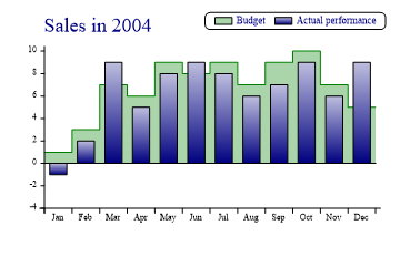
budget = new int[] {1,3,7,6,9,8,9,7,9,10,7,5,5};
actual = new int[] {-1,2,9,5,8,9,8,6,7,9,6,9};

sp.Heading = "Sales in 2004";
sp.HeadingStyle = HeadingStyles.Left;

sp.SetColors(new Color[]{Color.Green,Color.Navy});
sp.SetFillStyles(new FillStyle[]{FillStyle.Halftone,FillStyle.GradientBottom});

sp.SetYRange(-3,10);
sp.Baseline = 0;

sp.XAxisStyle = XAxisStyles.MiddleLabels;
sp.SetXLabels(monthnames);

sp.StepChartStyle = StepChartStyles.SurfaceShading;

sp.DrawStepChart(budget);  // see Stepsuite

sp.DrawBarChart(actual);

sp.SetKeyText(new string[]{"Budget","Actual performance"});
sp.KeyStyle = KeyStyles.TopAlign|KeyStyles.RightAlign|KeyStyles.Boxed|KeyStyles.Rounded;
Note the use of a ‘baseline’ here to have the shading and bars drawn outwards from the zero-line rather than from the X-axis. The chart has been given an explicit Y-range to allow space for the extremes from both series.
Summary
The Stepchart may be used on its own, but is often most useful in combination with other chart types.