| Automated charting and reporting |
General Tutorials
Style Examples
SharpLeaf Tutorials
Document Layout Tutorials
Text Flow Tutorials
Table Tutorials
Visual Glossaries
SharpPlot Reference
SharpPlot Class
SharpPlot Properties
SharpPlot Methods
SharpPlot Structures
SharpPlot Enumerations
PageMap Class
SharpLeaf Reference
SharpLeaf Class
SharpLeaf Properties
SharpLeaf Methods
Table Class
Table Properties
Table Methods
SharpLeaf Structures
FontType Structure
ParagraphStyle Structure
BoxStyle Structure
SharpLeaf Enumerations
DocumentLayout Classes
DocumentLayout Class
PageLayout Class
PageElement Abstract Class
Frame : PageElement Class
TextBlock : PageElement Class
ImageBlock : PageElement Class
Box : PageElement Class
Rule : PageElement Class
Common Reference
Document Class
VectorMath Class
DbUtil Class
Download
Release Notes
Licensing
SharpPlot Tutorials > Chart Samples > Tower charts for 3D bars
Tower charts for 3D bars
Towercharts are good for visual impact, but are rarely an effective way to present numbers where the values are important. These examples parallel some of the examples in the tutorial on tables, as a Towerchart is really just a simple way to present a two-way tabulation in visual form.
A Simple Towerchart from Arrays of Data
SharpPlot expects the data as an array of arrays of values – each inner array is plotted parallel to the X-axis and they work back towards the backplane. This means that they are best drawn with the smaller values in the earlier arrays, each of which is itself arranged from larger to smaller values – this way the towers are less likely to hide each other.
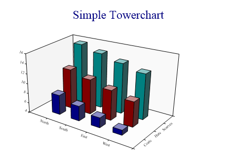
towers = new int[][]{new int[]{8,7,6,5},new int[]{12,11,10,9},new int[]{16,15,14,13}};

sp.SetMargins(48,12,24,0);

sp.Heading = "Simple Towerchart";
sp.SetXLabels(new string[]{"North","South","East","West"});
sp.SetYLabels(new string[]{"Coats","Hats","Scarves"});

sp.TowerChartStyle = TowerChartStyles.WallShading;

sp.DrawTowerChart(towers);
Note that both the X and Y axes simply display the towers in sequence – there is no equivalent of XBarchart available here to allow towers to be placed in specific places on the XY grid. The axes will be automatically labelled with the tower number unless you give your own labels (as here).
Using Towers to Summarise Data
This example displays a one-way summary in a style very like the Excel Column chart. The perspective drawing has been turned off here to give the effect of an isometric projection.

housetype = new int[] {1,2,2,3,3,2,1,1,2,4,4,1,2,2,3,2,1,1,2,3,1,1,4,3,1,2,2,2,4};
price = new int[] {60500,47500,46000,110000,148000,65000,79950,54000,120000,85000,
         65000,55000,70000,82500,78500,49950,46950,46950,77000,102000,37500,68000,
         65000,145000,98000,75000,96500,53950,75000};

sp.Heading = "Maximum Price by House Type";

sp.GroupBy(housetype,GroupByFunction.Maximum);
sp.SetXLabels(new string[]{"Terrace","Semi","Detached","Bungalow"});

// Force isometric and horizontal X-Axis
sp.SetViewpoint(8,0,80);
sp.Perspective = 0;

sp.TowerChartStyle = TowerChartStyles.WallShading|TowerChartStyles.GridLines;

sp.ZFactor = 1000;
sp.ZCaption = "£Thousand";
sp.ZAxisStyle = ZAxisStyles.AtEndCaption;
sp.DrawTowerChart(price);
Note that the X-axis labels have been explicitly set here – for text categories they would be automatically created as the distinct elements in the group.
Two-way Summary shown as Towers
You can think of a Towerchart as a grouped barchart, with the splitting working away from the X-axis, rather than into collections of narrow bars.
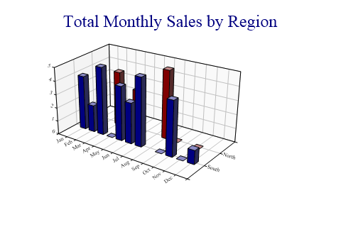
region = new string[]{"North","North","North","North","South","South","South",
         "South","South","South","South","South"};
regions = new string[]{"South","North"};

month = new string[]{"Jan","Mar","May","Aug","Jan","Feb","Mar","May","Jun","Jul","Oct","Dec"};
sales = new int[] {3,4,3,5,4,2,5,4,3,5,4,1};
months = new string[]{"Jan","Feb","Mar","Apr","May","Jun","Jul","Aug","Sep","Oct",
         "Nov","Dec"};

sp.Heading = "Total Monthly Sales by Region";
sp.GroupBy(month,months);  // Sum is default
sp.SplitBy(region,regions);

sp.XAxisStyle = XAxisStyles.AngledLabels;
sp.YAxisStyle = YAxisStyles.AngledLabels;

sp.TowerChartStyle = TowerChartStyles.WallShading|TowerChartStyles.GridLines;
sp.DrawTowerChart(sales);
Towers are normally drawn with relatively few parallel sets of columns, so it is generally best to have the category with most entries as the ‘groups’ and the one with fewer entries as the ‘split’.
Adding Visual Pizzazz
This final chart shows some simple effects with gradient fills which can be used to add that ‘designer’ look to the chart.
towers = new int[][]{new int[]{8,7,6},new int[]{12,11,10},new int[]{16,15,14},new
         int[]{21,18,15}};

sp.SetMargins(12,6,18,0);

sp.TowerChartStyle = TowerChartStyles.WallShading|TowerChartStyles.GridLines|
         TowerChartStyles.Plain;
sp.ZAxisStyle = ZAxisStyles.ForceZero;

sp.SetTowerFillStyles(FillStyle.Saturate20,FillStyle.GradientBottomRight,FillStyle.Solid);
sp.SetWallFillStyles(FillStyle.GradientBottomRight,FillStyle.GradientBottomLeft,
         FillStyle.GradientTopLeft);
sp.SetViewpoint(22,15,50);

sp.TowerAspect = 2;
sp.BarEdgeNib = 0;

sp.DrawTowerChart(towers);
For charts rendered as vector graphics (SVG, VML etc) this adds very little to the size of the output file. For images (such as PNG) it will greatly increase the file size as the image compression will find very few areas of solid color.
Summary
The Towerchart is a good presentational tool for small amounts of data which falls naturally into categories. It is often necessary to arrange the categories to put the bigger towers at the back, as it is very easy to obscure data otherwise.