| Automated charting and reporting |
SharpPlot Tutorials
General Tutorials
Chart Samples
Style Examples
SharpLeaf Tutorials
Document Layout Tutorials
Text Flow Tutorials
Table Tutorials
Visual Glossaries
SharpPlot Class
SharpPlot Properties
SharpPlot Structures
SharpPlot Enumerations
PageMap Class
SharpLeaf Reference
SharpLeaf Class
SharpLeaf Properties
SharpLeaf Methods
Table Class
Table Properties
Table Methods
SharpLeaf Structures
FontType Structure
ParagraphStyle Structure
BoxStyle Structure
SharpLeaf Enumerations
DocumentLayout Classes
DocumentLayout Class
PageLayout Class
PageElement Abstract Class
Frame : PageElement Class
TextBlock : PageElement Class
ImageBlock : PageElement Class
Box : PageElement Class
Rule : PageElement Class
Common Reference
Document Class
VectorMath Class
DbUtil Class
Download
Release Notes
Licensing
SharpPlot Reference > SharpPlot Methods > DrawDialChart Method
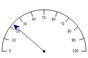
SharpPlot.DrawDialChart Method
Draw a dial or gauge from one or more data values, with optional warning zones.
Example
sp = new SharpPlot(180,120);
sp.SetMargins(10,10,0,0);
sp.DialChartStyle = DialChartStyles.ArrowLines;
sp.SetXRange(0,100);
sp.DrawDialChart(23);
The short tutorial shows a few of the possibilities and some sample code.
Overloads
- public void DrawDialChart(double data);
- public void DrawDialChart(int[] data);
- public void DrawDialChart(double[] data);
- public void DrawDialChart(int[] data,int[] radii);
- public void DrawDialChart(double[] data,int[] radii);
Description
The Dial or Gauge chart is often used to present a single value (maybe a benchmark index of company performance) in the context of an expected or desired range. The value on its own may mean very little (maybe our production plant made 23% rejects last week) until it is set in the context of the expected range (say 20% – 30% is normal, 30-40% is unusually poor, and so on). The dial chart can be set up with a range to cover the likely values, and a series of colored ‘zones’ to indicate the actions appropriate to each value – typically OK, Warning, Critical.
Dials are often grouped in the likeness of a dashboard or aircraft cockpit to give the user a degree of familiarity with the experience of monitoring the various instruments found in a vehicle or aeroplane.
See also ...
Dials and Gauges for isolated numbers | SharpPlot Members | SharpPlot.DialChartStyle Property